Experience customization
Experience customization is a pattern which guides users through configuring their application settings—including regional, visual, and functional formats—on first use or later use, to ensure the interface is fully optimized for their specific preferences.
Use the Experience customization pattern to establish or update foundational settings that align with the user’s application UI preferences. It gives users intentional, explicit control to bridge the gap between a generic experience and one tailored to their workflow.
- Onboarding (Wizard): A guided, step-by-step experience used to initialize the workspace and capture essential preferences upon the user’s first entry into the application. Establishing accessibility defaults during this setup phase ensures a compliant environment from the very first session.
- Ongoing customization: A persistent entry point that allows users to return and adjust their environment as their operational needs evolve.
To comply with ADA and WCAG expectations, implement onboarding (Wizard) and an always-available ongoing customization entry point (Preferences dialog) as a paired capability: onboarding (Wizard) establishes an accessible, conforming default configuration, and ongoing customization (Preferences dialog) provides predictable, ongoing access to the same experience settings so users can revisit and adjust preferences as needs change.
Typical groups of settings you might expose to your users are:
- Visual foundations: Theme, density, reduced motion
- Localization: Language, locale, time zone, and regional formats for currency/dates
- Data surfaces: Tables and charts configuration
- Governance: Role-based tailoring, notification channel selection, and security/access levels
- Structure: Workspace initialization, naming conventions, and project templates
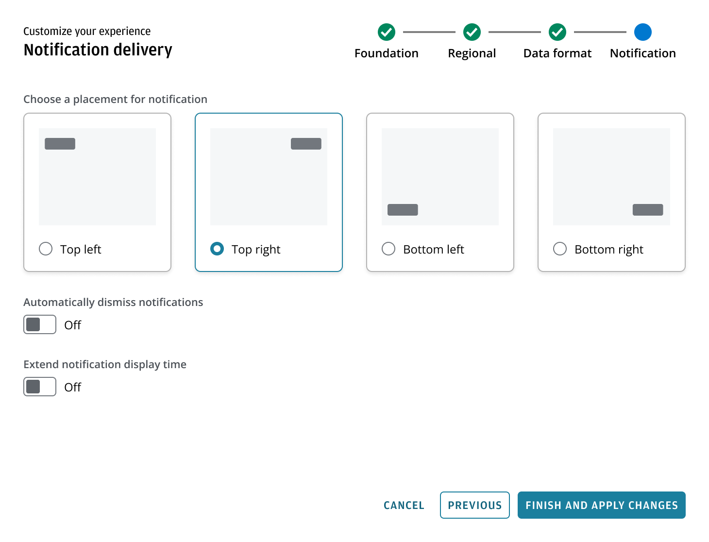
- Feedback / notification: Toast position, auto-dismiss, duration; notification preferences
The Experience customization pattern utilizes existing Salt components. Refer to the Wizard and Preference dialog for technical specifications.
- Pattern: Wizard
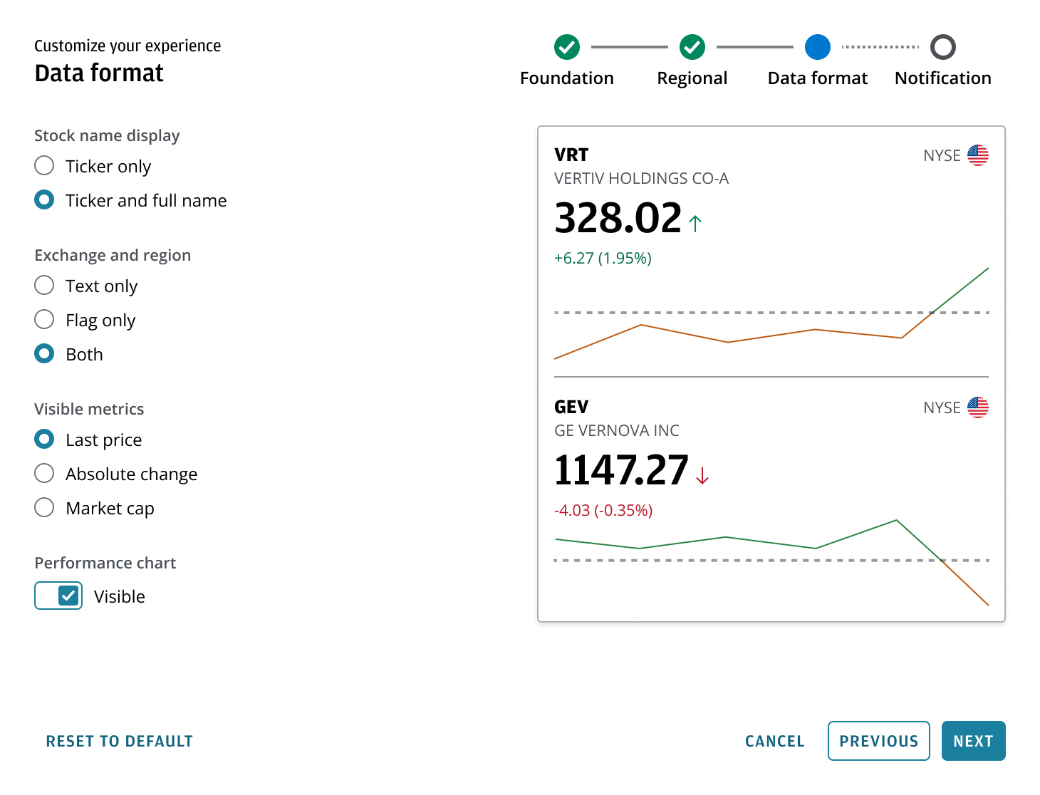
- Content area: This region is intended for selection model. Three patterns are available: standard control selection using switches, radio buttons, and selects for clear, label-driven choices; card or tile selection for scannable, comparable options; and dynamic live preview for configurations where multiple settings combine and users need to see results before committing, such as data grid or chart configuration.
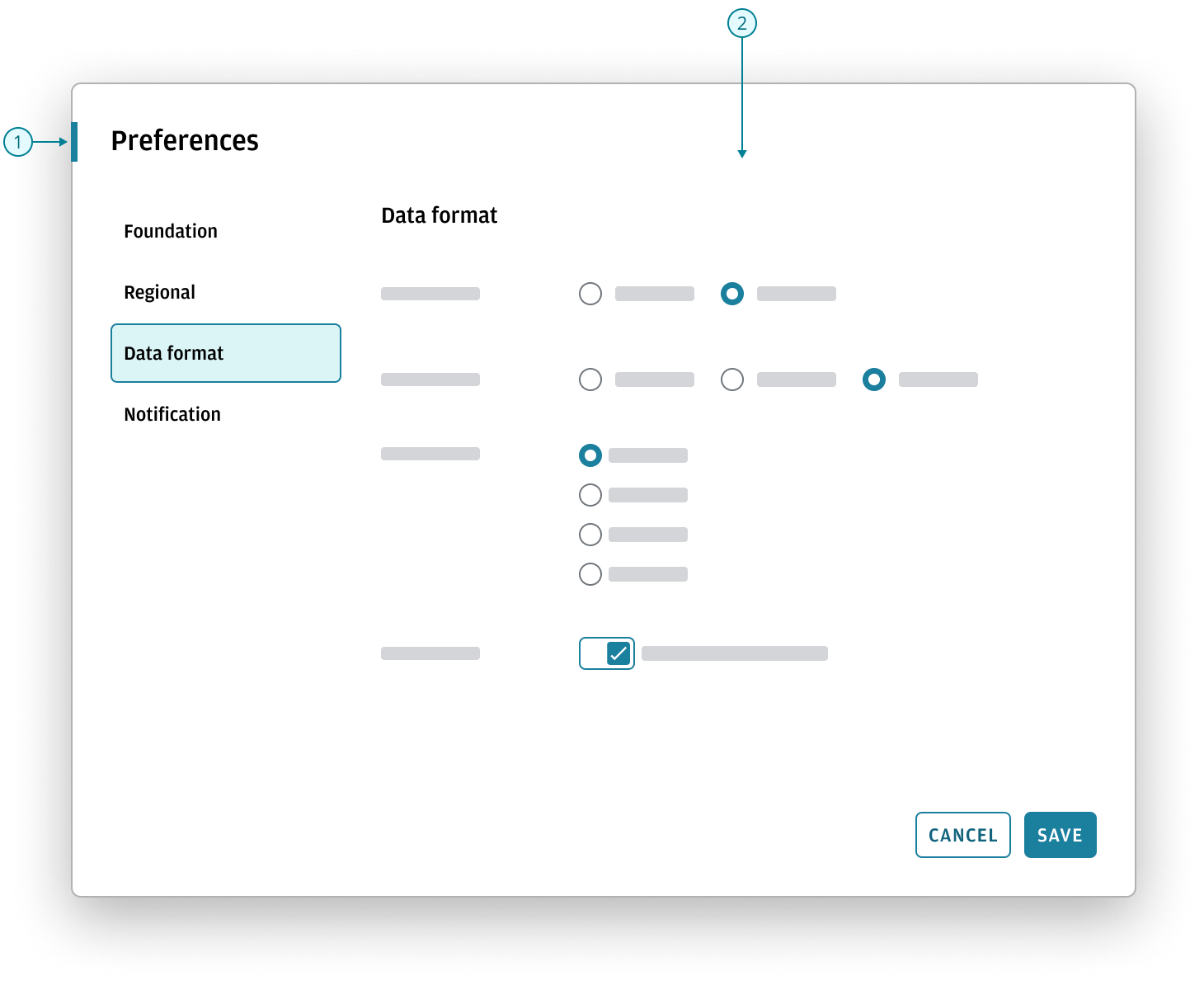
- Pattern: Preference dialog
- Content area: In this persistent context, use standard control selection with clear, label-driven controls. Since users are introduced to these settings during onboarding, ongoing customization should focus on familiar adjustments with clear, easily understood results.
The steps below summarize Salt-specific user preferences that may be made available for configuration.
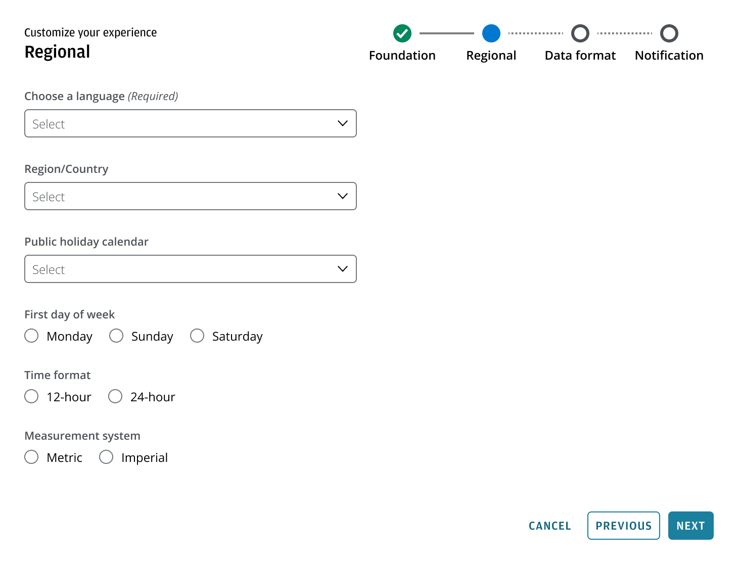
- Foundations: Establish global behavior first.
- Data interpretation: Ensure data is understood consistently.
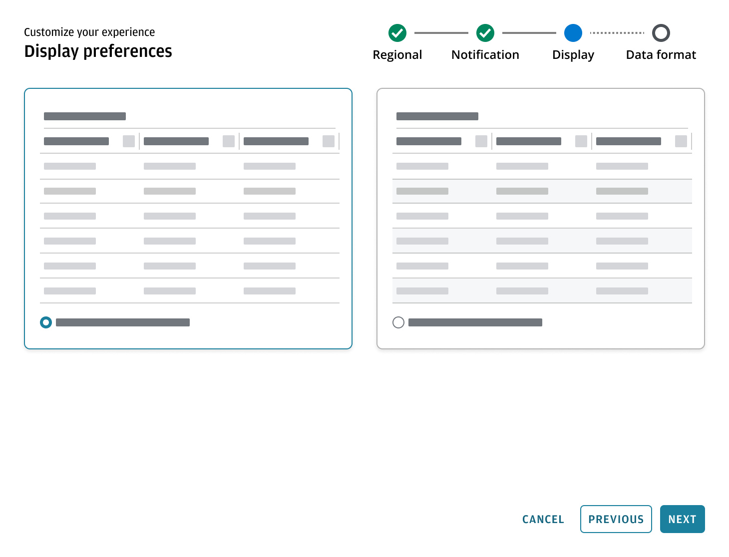
- Data surfaces: Configure tables and charts, where multiple settings combine and users benefit from seeing outcomes live before finalizing selections.
- Feedback: Finalize how the system provides feedback after core reading and interpretation is set.
| Step | Stage | What the user sets | Sequence rationale |
|---|---|---|---|
| 1 | Foundation | Theme, Density, Reduced motion | Establishes global system behavior first |
| 2 | Data interpretation | Number format, Currency format, Date/Time format, Locale, and timezone if needed | Ensures data is immediately understandable and consistently interpreted before configuring surfaces |
| 3 | Data surfaces | Tables (live preview): Columns, Sorting, Density/Compact, Zebra striping. Charts (live preview): Lines, Patterns, Markers, Labels, Grid lines, Legend. | Outcomes are cumulative, so users need to see results live before setting; this is the core step because it shapes how data is read and understood |
| 4 | Feedback | Toast position, Auto-dismiss, Duration | Finalizes how the system provides feedback after core reading/interpretation is set |
The selection model uses an escalation-based approach for presenting configuration choices in Experience customization, progressing from Standard controls to Card selection to Dynamic live preview based on complexity and cumulative visual impact. This approach aligns options with user comprehension, supports WCAG 2.2 accessibility guidelines, and ensures all choices are practical within the Salt design system.
| Pattern | Use when | Typical examples | Best for |
|---|---|---|---|
| Standard controls | Labels clearly communicate the outcome without needing visual comparison | Date format, currency, reduced motion (on/off), value labels (show/hide) | High-volume (5+ options) and efficiency |
| Card selection | The difference is best understood visually and there are typically 2–4 options | Theme (light/dark), density, toast position | Low-volume (2–4 options) and visual state |
| Dynamic live preview | Multiple settings combine and users need to see results before committing | Data grid configuration, chart configuration | Complex tasks and real-time validation |
Focus on configuration that changes how the system communicates data—supporting readability, structure, and interpretation—without exposing styling, component design, or system logic.
The following examples show how the choice of selection pattern is guided by the specific needs of each workflow.
Use standard controls for familiar, functional settings such as language selection, time zone selection, or an automatic translate toggle. These options are clearly described by labels alone, so adding visual examples would be redundant and take up unnecessary screen space. Standard controls are the most effective pattern for these straightforward choices.
Use a dynamic live preview for report-oriented presentation choices, such as selecting which metadata appears and how it’s displayed. This approach is ideal when users have specific requirements and need confidence in the final output. By showing results as settings change, a dynamic live preview reduces trial and error and minimizes the need to revisit settings later.
Use card selection for settings that lead to meaningful changes in the interface layout, such as notification placement. Card selection allows users to compare distinct visual states side by side, making it easier to understand and choose the desired outcome without extra cognitive effort.
Switches can be used in multi-step wizards even when changes don’t take effect immediately. Use switches only for true on/off choices, and make any final behavior unmistakable—for example, label the final button 'Finish and apply changes' instead of just 'Finish'.
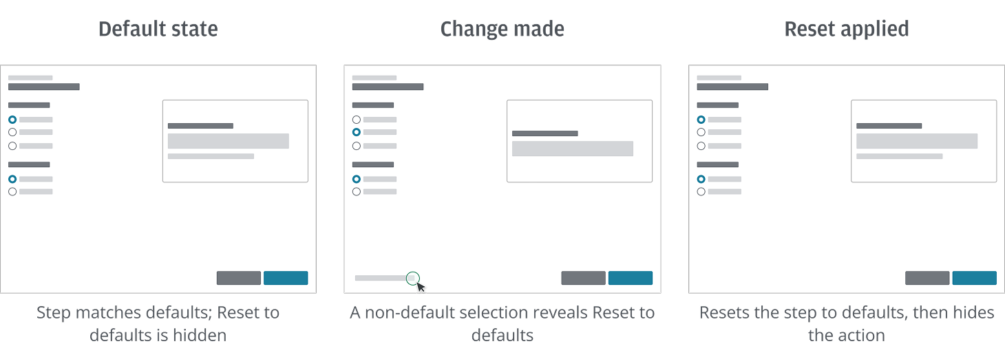
Use progressive disclosure to show 'Reset to default' button only when the current step is no longer in its default state.
The action is hidden when the step matches defaults, and revealed once the user selects any non-default option. When selected, it returns the affected settings in the current step to their default state and updates the UI; once defaults are restored, the action is hidden again.
Apply the Experience customization pattern when an application offers explicit options that require deliberate user selection. This is especially important for choices that may impact accessibility, compliance, or system governance. Ensure users understand the implications of their selections before they proceed. This section focuses on user-driven preferences where the goal is informed choice and easy recovery, not enforcement.
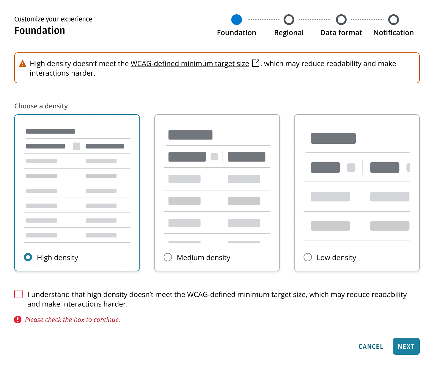
When a user selects an option that may not meet accessibility requirements, present clear guidance explaining the implications and trade-offs before the user proceeds. Where available, include a link to supporting accessibility guidance. If this guidance is displayed as a banner while the selection is active, ensure it is removed once the user switches back to an option that meets accessibility requirements.
When a user selects an option that may not meet accessibility requirements or may reduce usability for some users, require an explicit acknowledgement before they proceed. The acknowledgement should restate the selected option and its potential impact.
Support easy recovery by ensuring users can change or undo their selection and return to an option that meets accessibility requirements. Where a default setting exists and is applicable to the flow, provide a clear way to return to the default.
Use this pattern when an application provides explicit options—such as a security profile or data-sharing tier—that require a conscious selection to meet governance, compliance, or security standards.
Because the workflow cannot continue without this input, the interface must guide the user through a clear validation sequence that maintains focus and accessibility.
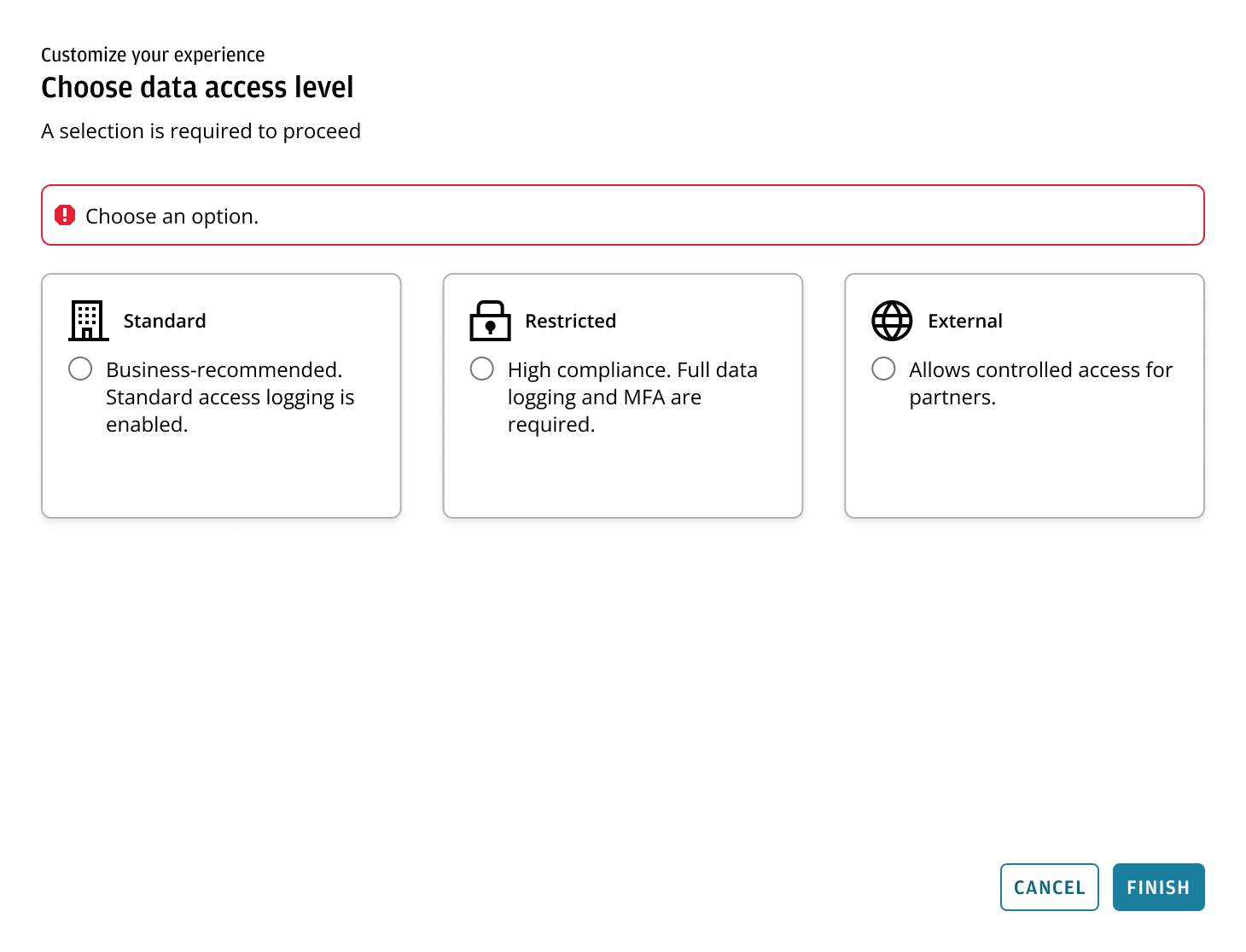
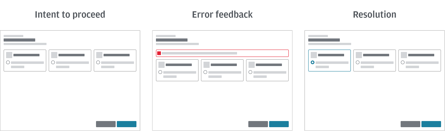
The following sequence illustrates the expected behavior when a mandatory selection is required. This logic ensures the interface remains navigable while clearly communicating missing requirements.
- Intent to proceed: The user attempts to move forward by clicking 'Next' or 'Finish'. To maintain accessibility and discoverability, the button remains enabled. Because no selection has been made, the system initiates a validation check.
- Error feedback: A validation banner appears at the top of the content area to provide immediate context, and the specific component updates to an error state to highlight exactly where the user needs to take action. If a stepper is present, it also updates to an error state to reflect the same missing requirement.
- Resolution: Once the user selects an option, the requirement is satisfied. The validation banner and error states (including the stepper, if present) are cleared, and the user can click 'Next' or 'Finish' again to successfully proceed.
Explicit requirements: Use the label or description in the header section to clearly communicate that a selection is required to proceed.