Formatted input
Formatted input is an input behavior that guides and validates user-entered data against a defined format or pattern (e.g., phone numbers, card numbers, currency amounts, postal/ZIP codes, etc.). When the user types or submits the value, it's checked against the pattern and presented in a consistent formatted style to match that pattern.
- When user input must follow a specific format.
- When visual formatting improves data entry accuracy and readability.
- When validation against a format pattern is required.
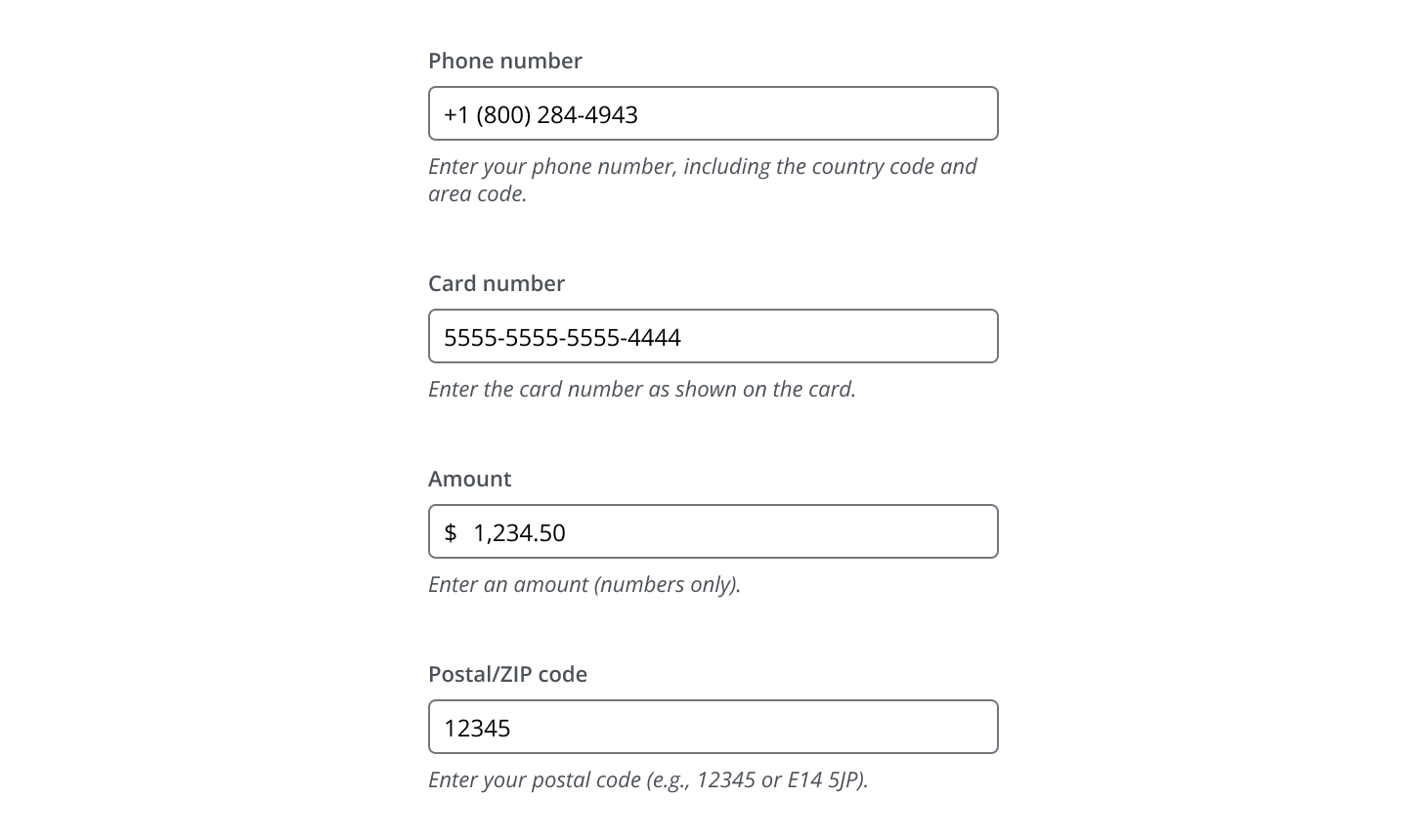
- Common formats include phone numbers, card numbers, currency amounts, and postal/ZIP codes.
Depending on the use case, consider these existing Salt options:
- Number input: Best for numeric values that require increment/decrement controls or adjustments within a defined range.
- Date input: Best for single dates or date ranges.
- International phone number input (pattern): Best for country-specific phone number entry with a location selector.
Formatted input contains:
- Label: Helps users understand what information to provide.
- Input field: A single input field where users type their value.
- Helper text: Assists users in providing the right information.

- Use Input to capture the user's value.
- Use FormField to wrap Input with visible label, helper text and a status message.

Best practices
- Wrap the input in FormField to provide a visible label, help text, and a validation status message—supporting accessibility compliance. For more guidance, refer to the W3C form instructions.
- Follow Input and FormField specifications for accessibility and consistency.
- For instructions on formatting form fields, please refer to the CIB Digital Content Style Guide.
Use helper text to provide formatting guidance and/or an example of the expected format.

Best practices
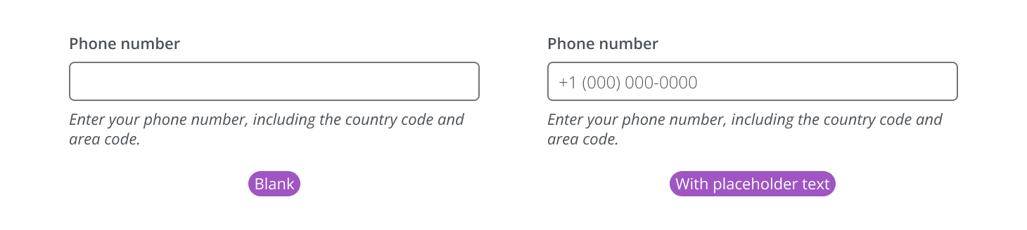
Placeholder text should never be the only source of guidance. Placeholder text disappears once the user begins typing and may not be announced by all screen readers, so it must not be used to convey required formatting rules. Use labels and helper text to provide persistent formatting guidance. If you include placeholder text, use it only as a supplementary hint or example.
The user types freely into the input and the value is formatted to a defined pattern when the user clicks away (or moves their focus) from the field.
This pattern applies formatting on blur (after the user finishes and leaves the field) to keep interaction predictable and avoid unexpected changes during input, aligning with WCAG 2.1 guidance on predictable behavior for focus and input changes.
- Blank (no placeholder): Field is empty with no visible mask; label/helper text provide guidance.
- With placeholder text: Field shows an example format as placeholder text until the user types.
The user is actively entering or modifying the value.

After the user finishes typing and leaves the input, the system formats the value into the defined pattern and shows it in the field.

When the user focuses a previously formatted field again, revert the input to the original value the user typed (the editing value). This supports a predictable editing experience by letting users continue from their last input without the system altering what they entered.

Validate user typed characters in formatted inputs by checking whether the entered value matches the expected pattern and formatting rules. This validation can be shown in real time while typing, on blur, or after submission, depending on the use case and severity of the rule.
For general validation behavior (error, warning, success states), refer to FormField's validation guidance.
When the value does not meet the required format or criteria.
- Input turns to error state.
- An error message is displayed to guide the user.

When the value is technically correct but has potential issues.
- Input turns to warning state.
- A warning message is displayed to guide the user.

Use a success state to reassure users when their input is correct. Avoid unnecessary success messages unless confirmation is important for the workflow.
When the value is valid:
- No error or warning message is displayed.
- An optional success indicator can be displayed.

For additional information on warning, error, and success messages, please refer to the CIB Digital Content Style Guide.
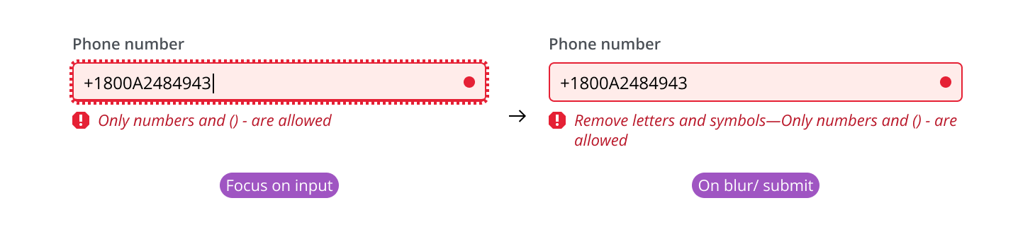
If the user types a value that isn't compliant with the rules of the format pattern, show validation feedback while they are entering the value.
Show the input with its normal helper text.

As the user enters a value, validate characters in real time.

Immediately show an error state. Replace the default helper text with a clear message explaining what’s allowed (e.g., “Only numbers and () - are allowed”).

If the user removes the invalid character, dismiss the error and restore the original helper text.

If the user leaves the field without correcting the value, keep the error state on blur/submit until resolved.
Best practices
Reuse the same error message when possible for consistency; only change it if the blur/submit message adds clearer next steps without contradicting the real-time one.
Input normalization is the practice of converting user-entered values into a consistent, expected representation—without forcing users to type in one exact format. The user should be able to enter the value in any format that is familiar to them, after which point the value is normalized to the preferred format of the system. This improves usability when the meaning of the value is clear, but the format varies (e.g., hyphens vs. spaces, parentheses, capitalization, leading/trailing whitespace).

- Accept flexible input while typing (don’t over-restrict keystrokes).
- Normalize on blur (or on submit) to a canonical format.
- Validate after normalization and provide clear feedback if rules are violated.
Defining normalization rules
Product teams should define normalization rules that match their domain, validation requirements, and downstream system needs.
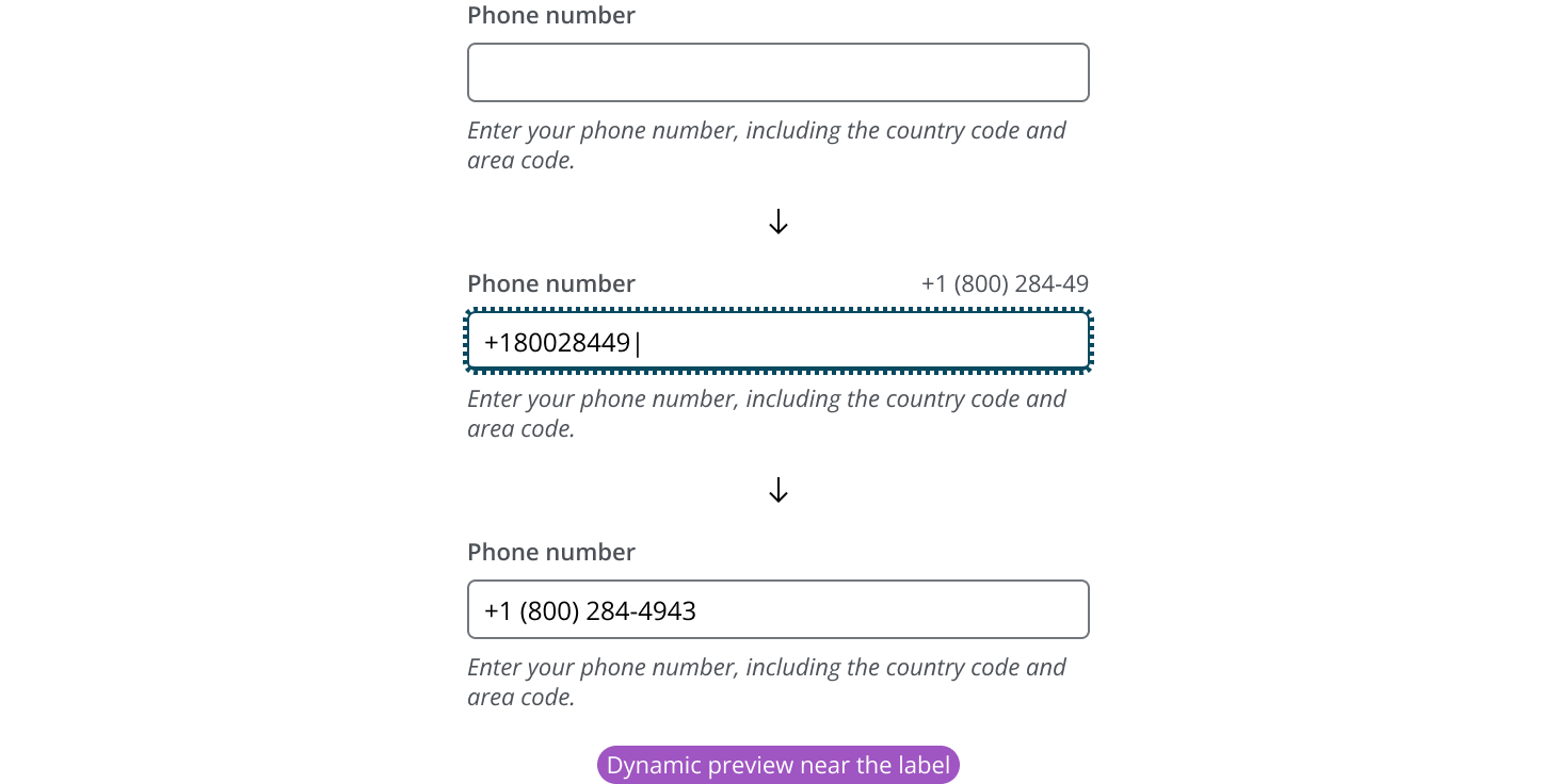
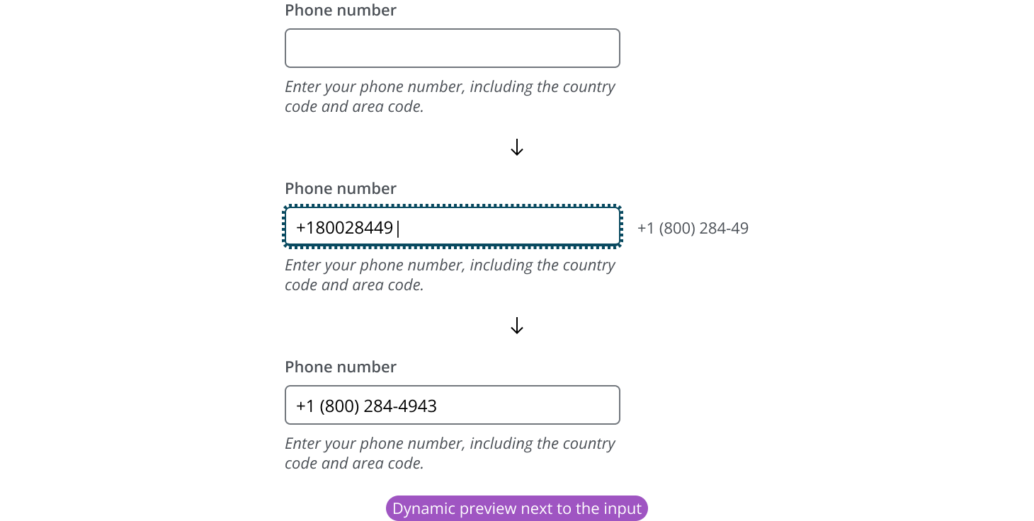
Dynamic preview shows the formatted result in real time as the user types. It helps users understand how formatting will be applied. While the user is typing, display a formatted preview of the value (without interrupting input).
- When the user leaves the field, the preview can disappear, since the input itself should now display the final formatted value.
- The preview can appear near the label or next to the input, depending on the layout.
Best practices
- Place the dynamic preview near the label when there is enough space and it won’t compete with or crowd the label content.
- If the label is likely to impede the preview, place the dynamic preview next to the input instead.
Users can paste a value into the input field. Pasted input follows the same rules as typed input:
- Validate the pasted value (including invalid characters) and show feedback.
- Normalize the value as needed (typically on blur or submit).
- Format on blur so the field displays the preferred system format after the user finishes and leaves the input.
If you need to expand the pattern or share feedback with us, please contact the team.